We are excited to unveil our new logo!
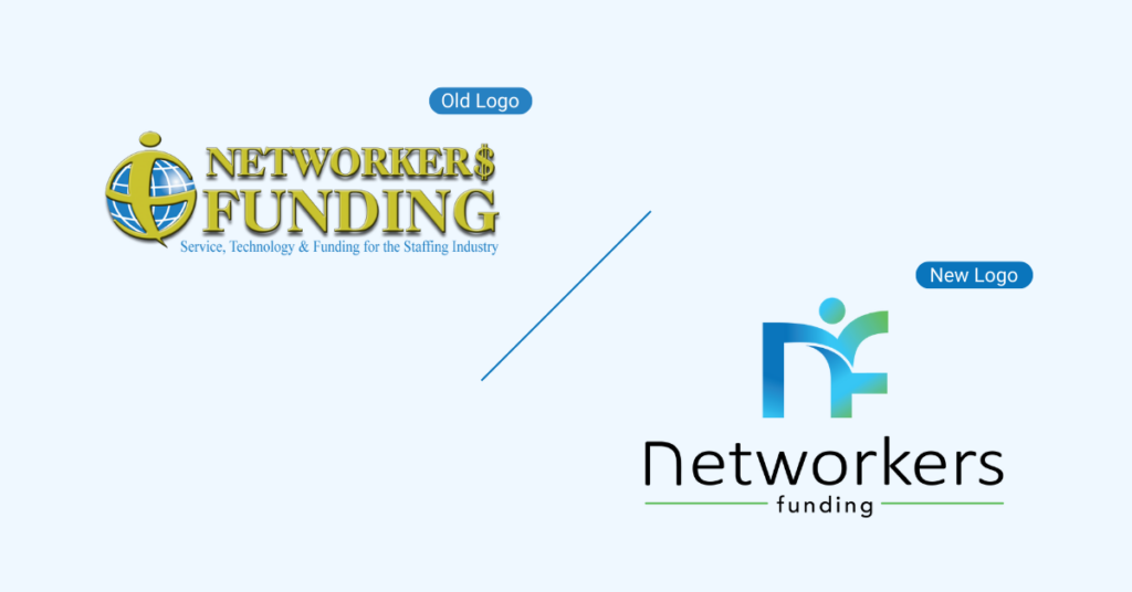
We are happy to announce the launch of our new logo! Our company has evolved so much since its inception in 2000, and we wanted our logo to reflect who we are today, our core values, and what we want to bring to the future.
A lot of creativity sessions went into the design of this new logo, and we want to share what it means to us.
Why lowercase?
The logo itself is in the shape of a lowercase nf for Networkers Funding. We were very intentional in having the letters be lowercase because we want it to represent how we take the back seat to our clients.
Jumping For Joy
We added a circle above the letters to illustrate a person jumping for joy. Let’s face it, everything we do is about people. That person is our clients and their very happy employees on pay day.
Colors
We decided to stick with the colors blue and green in the new logo. We made them more vibrant and playful. We like blue because it is the color of the sky, and with us, the sky is the limit! Of course, green is the color of money, which is a large part of what we do for our clients – payroll funding.
Flexibility
The curved letters represent the flexibility that we provide on a daily basis.
Let's Get
In Touch
We can’t wait to see your success become a reality.